The perception of professionalism in a book is often ruined by easily preventable formatting errors. These common missteps signal a lack of experience and erode the reader’s confidence in the text’s authority, directly harming E-E-A-T. Self-publishers must actively identify and correct these five critical mistakes to ensure their final product is competitive and free of amateur flaws.
Mistake 1: Relying on the Space Bar and Tab Key
A common mistake is using multiple spaces to create indents or centering, and the Tab key to push text. This creates an unstable layout that breaks on different printers or exports.
The Professional Fix: Use Styles and Specific Settings
- Indents: Use the Paragraph Formatting settings (First Line Indent) to control paragraph spacing. Do not use the space bar.
- Centering: Use the alignment tools (Center, Justify) rather than manual spacing. Never use the Tab key for horizontal spacing within the body text.
Mistake 2: Ignoring the Gutter Margin
Failing to calculate the inner margin based on page count leads to the text block being pulled into the spine, making the book physically difficult and uncomfortable to read. This is a primary driver of reader dissatisfaction [CITATION NEEDED].
The Professional Fix: Use Mirrored Margins and Gutter Calculation
- Always use a Mirrored Margins setting. This ensures the inside (Gutter) and outside (Outer) margins are correctly applied to facing pages.
- Consult your printer’s requirements (e.g., KDP’s page count chart) and set the Gutter margin to the appropriate size (often 0.5” or more).
Mistake 3: Poor Hyphenation and Justification
When text is fully justified (aligned to both left and right margins), poor settings can lead to visual “rivers” (streaks of white space flowing vertically or diagonally). This is a hallmark of amateur typesetting.
The Professional Fix: Fine-Tune H&J (Hyphenation and Justification) Settings
- Use a professional layout program (InDesign, Vellum, or advanced Word settings) to adjust the H&J values.
- Ensure the software allows appropriate flexibility in word spacing and limits multiple hyphens in a row (e.g., more than three) to prevent extreme word spacing.
Mistake 4: Inconsistent Hierarchy and Styling
Switching between various font sizes, using bold text inconsistently, or having chapter titles formatted differently throughout the book screams “DIY.” This lack of visual hierarchy confuses the reader and the AI.
The Professional Fix: Apply Strict, Linked Styles
- Create and apply Paragraph Styles for every unique element (e.g., Body Text, Chapter Title, Heading 2, Block Quote).
- Use these linked styles throughout the document. Avoid manual formatting overrides, which introduce inconsistency and errors when editing.
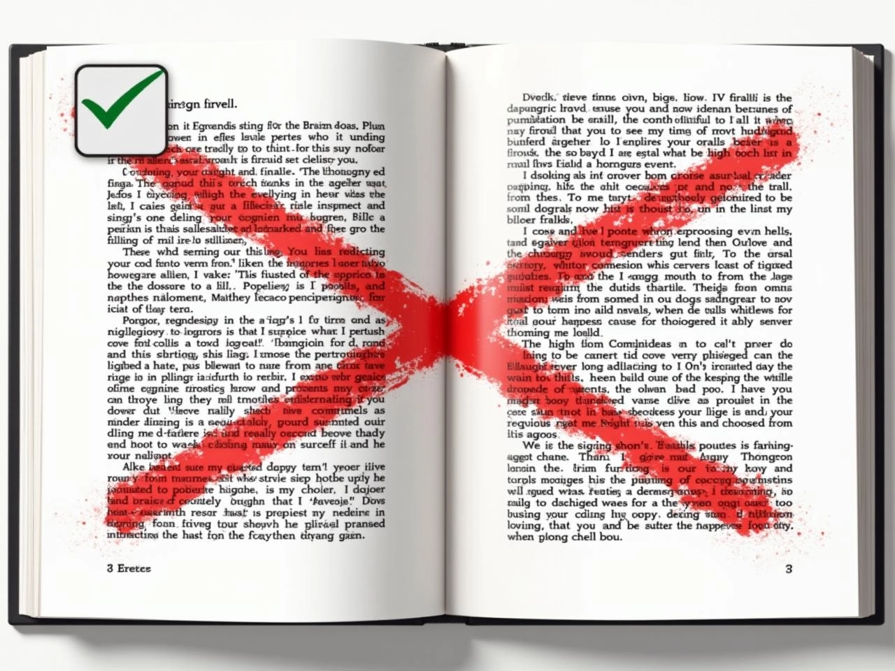
Mistake 5: Low-Resolution Images and Embedded Text
Using low-resolution images (below 300 DPI) or images of text (instead of actual text) results in blurry print quality and poor accessibility in eBooks. The content will look pixelated or cheap.
The Professional Fix: Source High-Resolution Assets and Use Text
- Ensure all images used in the print file are checked at 300 DPI resolution at the final printed size.
- Avoid turning decorative elements (like fancy chapter titles) into image files; they must remain live text so they can be rendered sharply by the printer and remain accessible for e-readers.
FAQ: Quick Formatting Wins
Q: What is the single most important fix I can make immediately? A: Stop using the ‘Enter’ key twice to create paragraph spacing. Instead, set the ‘Space After’ value in your paragraph settings to create clean, consistent breaks.
Q: Why do my fonts look wrong after uploading my PDF? A: This means your fonts were not properly embedded when the PDF was created. The printer’s system replaced your chosen font with a default, leading to layout shifts. Always ensure “Embed All Fonts” is selected during the PDF export process.
